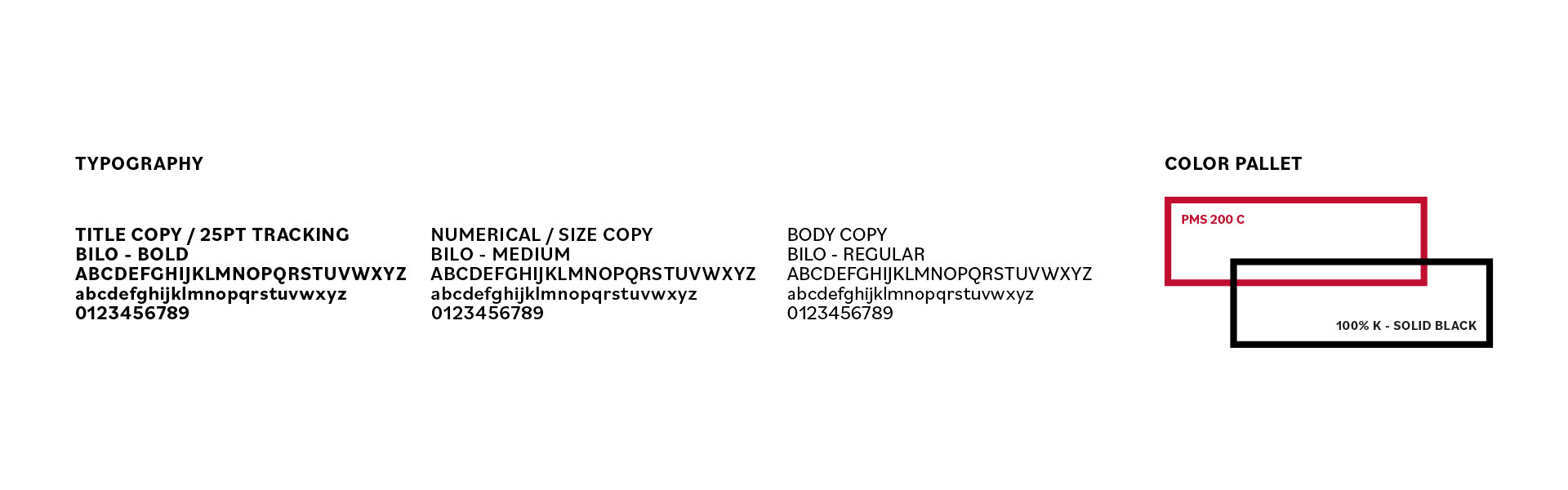
2023 Brand Redesign - Art Direction
Brand Mission:
Cooks is dedicated to bringing simplicity and value to the cooking products you rely on the most. With our streamlined features, we guarantee a consistent and foolproof experience every time you use our products. Our hard-working and affordable solutions are built to withstand the rigors of daily use while delivering excellent results. Cooks is committed to providing simple and affordable deliciousness consistently, ensuring your cooking endeavors are a success every time.
Project Goal:
One of JCPenney's legacy brands, established in 2005, has undergone several visual updates over the past 18 years. With this latest iteration, the goal is to make the brand more impactful and reposition it as a leading competitor in the entry-level cookware market, offering high-quality products that are accessible to everyone. The packaging design aims to communicate directly and boldly, prioritizing simplicity. By accentuating the product and streamlining the communication hierarchy, creating a solution that is easily comprehensible, reflecting the brand's essence of straightforwardness and user-friendliness.
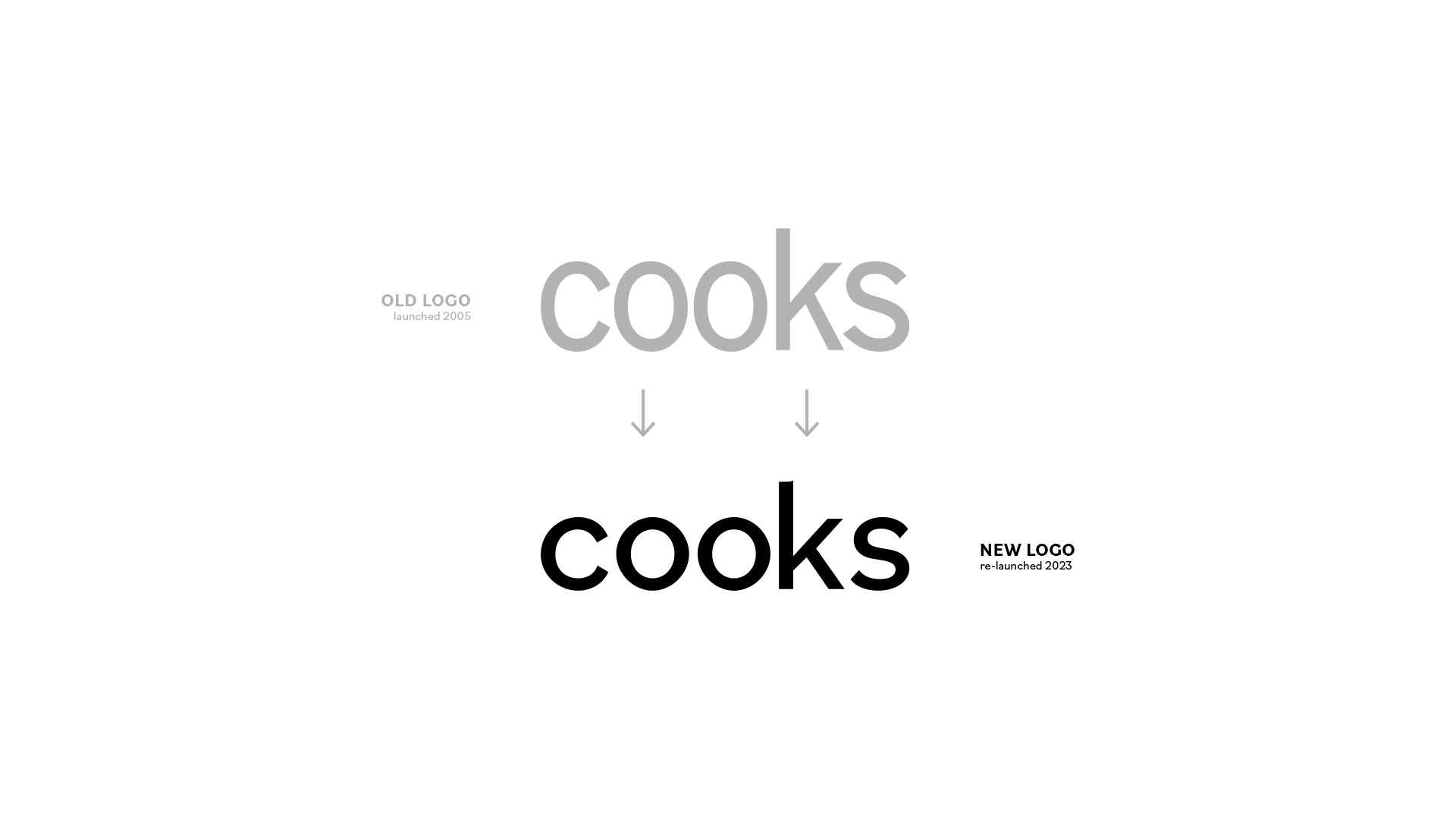
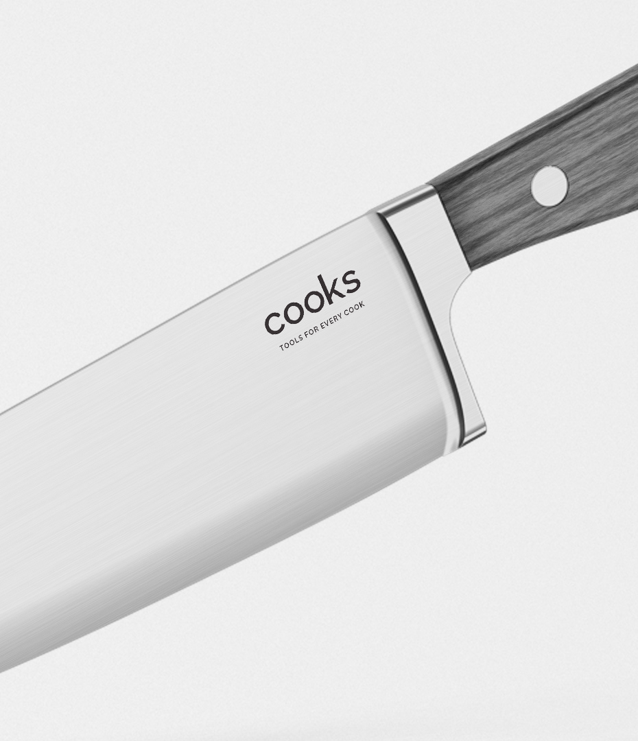
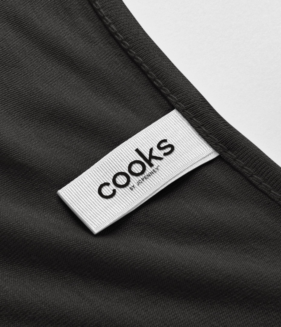
Logo Update
I aimed to modernize the original 2005 logo by incorporating symmetrical elements and utilizing a bold, graphic Neo-grotesque-inspired sans-serif font. This choice complements the clean and product-focused packaging design. When updating this legacy brand, it was crucial to maintain a level of familiarity for our customers. While we sought a refreshed new look, it was essential for the logo mark to retain instant brand recognition, ensuring a seamless connection with our consumers.
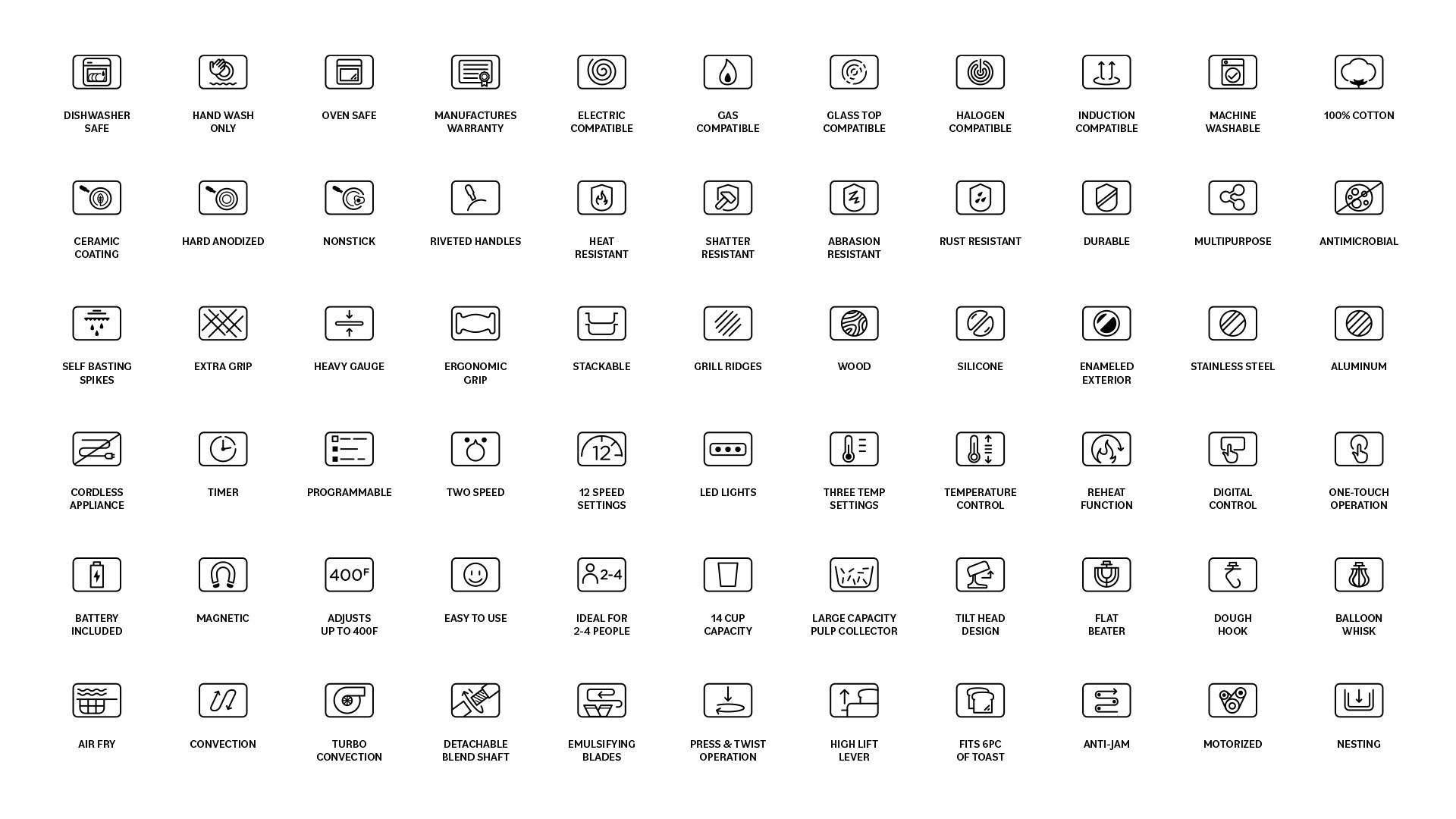
Iconography
Our approach emphasizes the use of simple, clean illustrations that deliver a clear message. These illustrations are paired with concise descriptors, enabling us to accurately and swiftly communicate complex product features to customers at the point of purchase. This approach extends seamlessly across multiple enterprise channels, ensuring consistent communication.
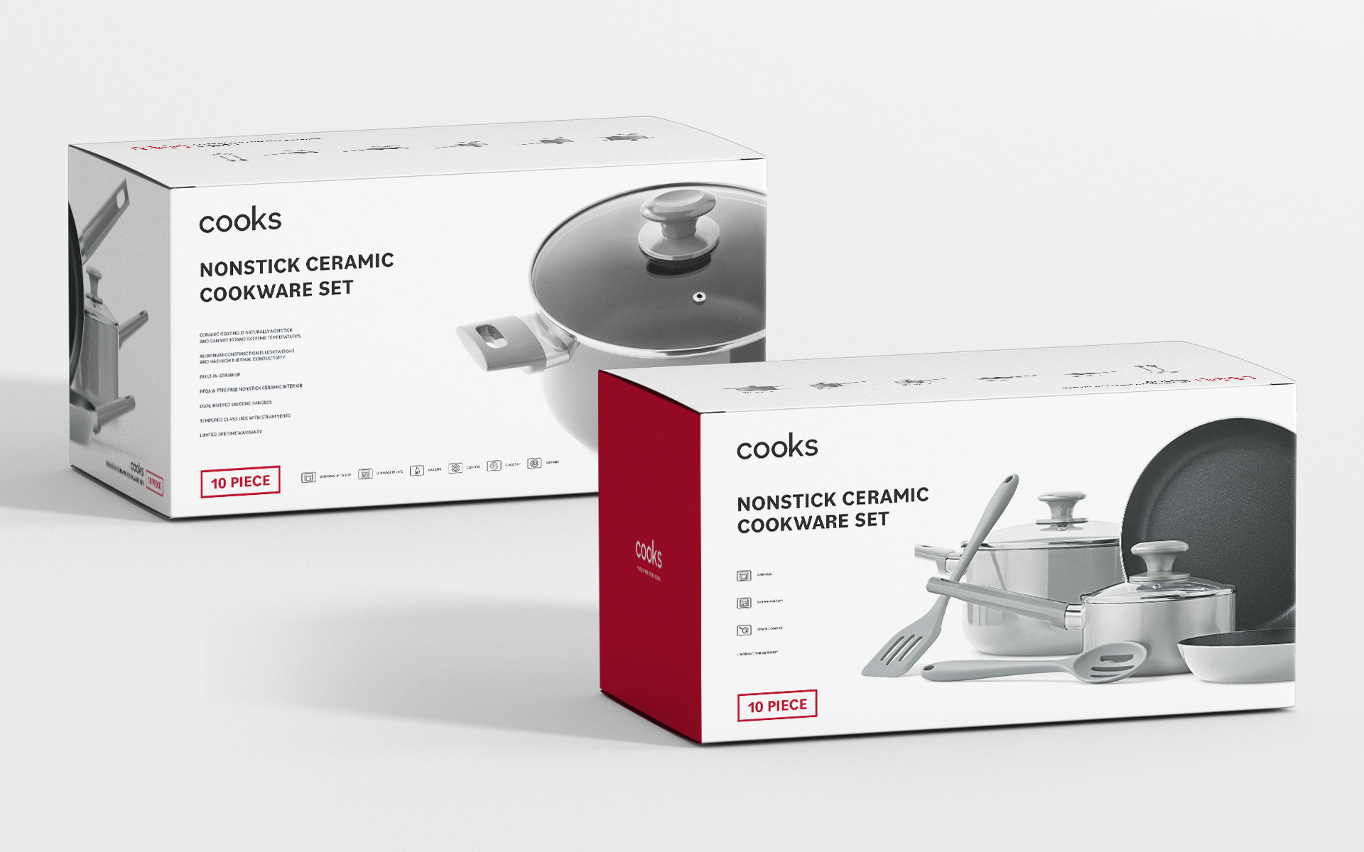
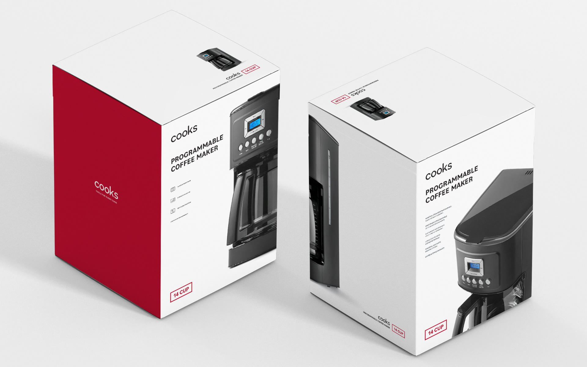
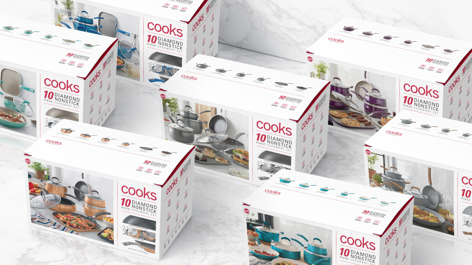
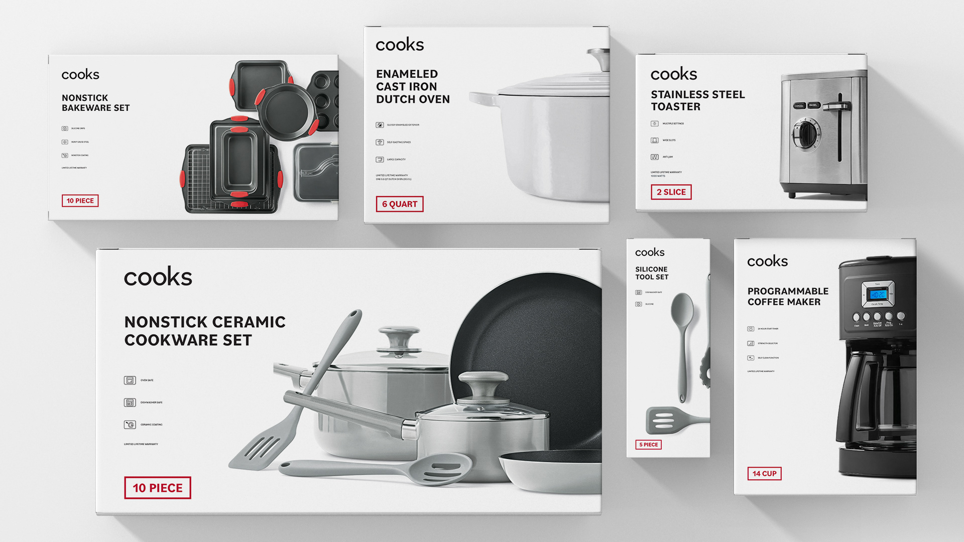
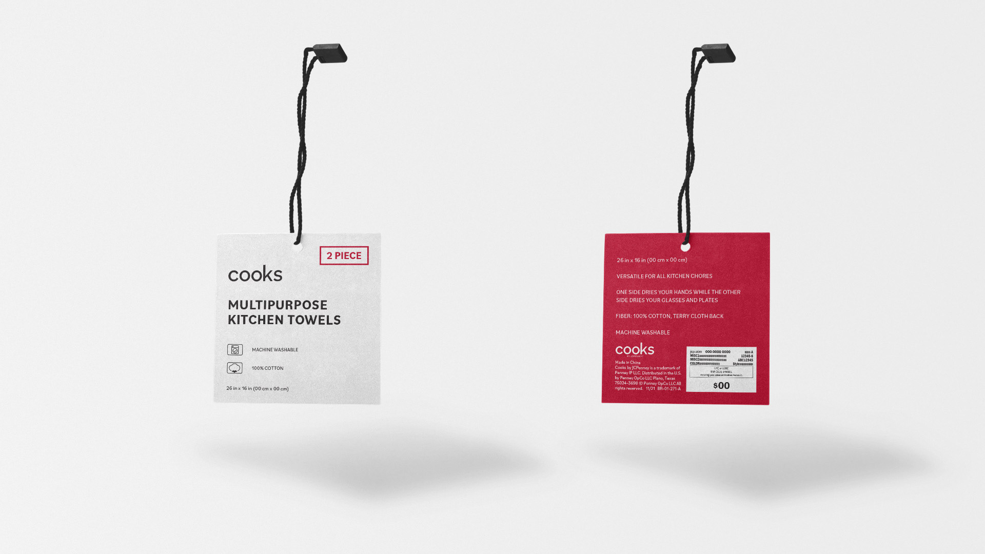
Packaging Design
Through extensive customer research and insights, we gained a deep understanding of the factors that are most important to consumers when making their purchasing decisions. Based on this understanding, we simplified our information hierarchy by eliminating unnecessary clutter present in previous designs.
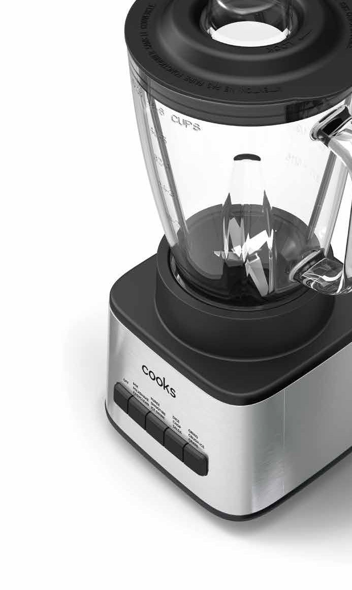
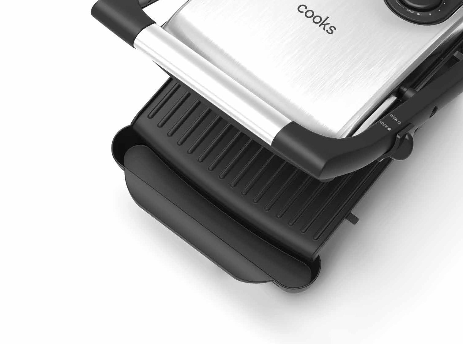
The front display panel of the packaging is designed to convey information quickly and effectively, with the most critical features highlighted prominently. On the other hand, the back of the packaging offers a more comprehensive explanation of the features, accompanied by a close-up image showcasing the product's superior quality. This approach caters to consumers who are initially drawn to the product's visual appeal, allowing them to delve deeper into its features and benefits once they interact with or pick up the packaging.
The design choice to wrap the graphic product image around the front corner of the box serves two purposes. Firstly, it provides unique merchandising opportunities, enabling the product to stand out on shelves or when stacked on the floor. Secondly, this design element adds depth and visual interest to an overall simplistic design, allowing customers to view the image from multiple angles.
Overall, our packaging design combines simplicity, functionality, and strategic merchandising techniques to create a compelling visual experience that resonates with consumers at various touch points.
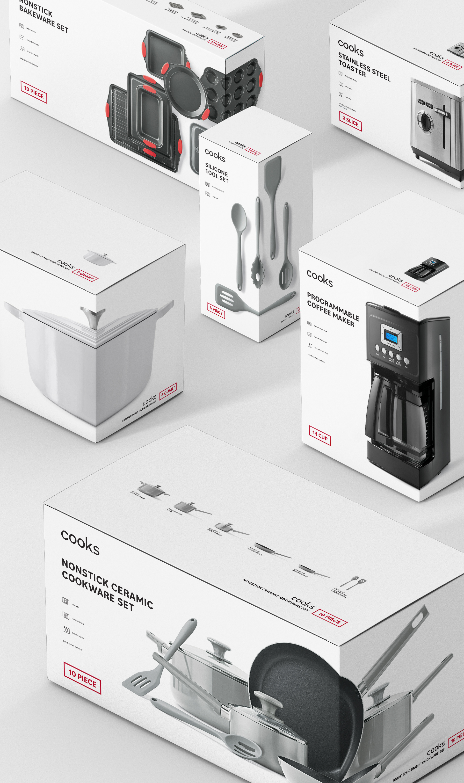
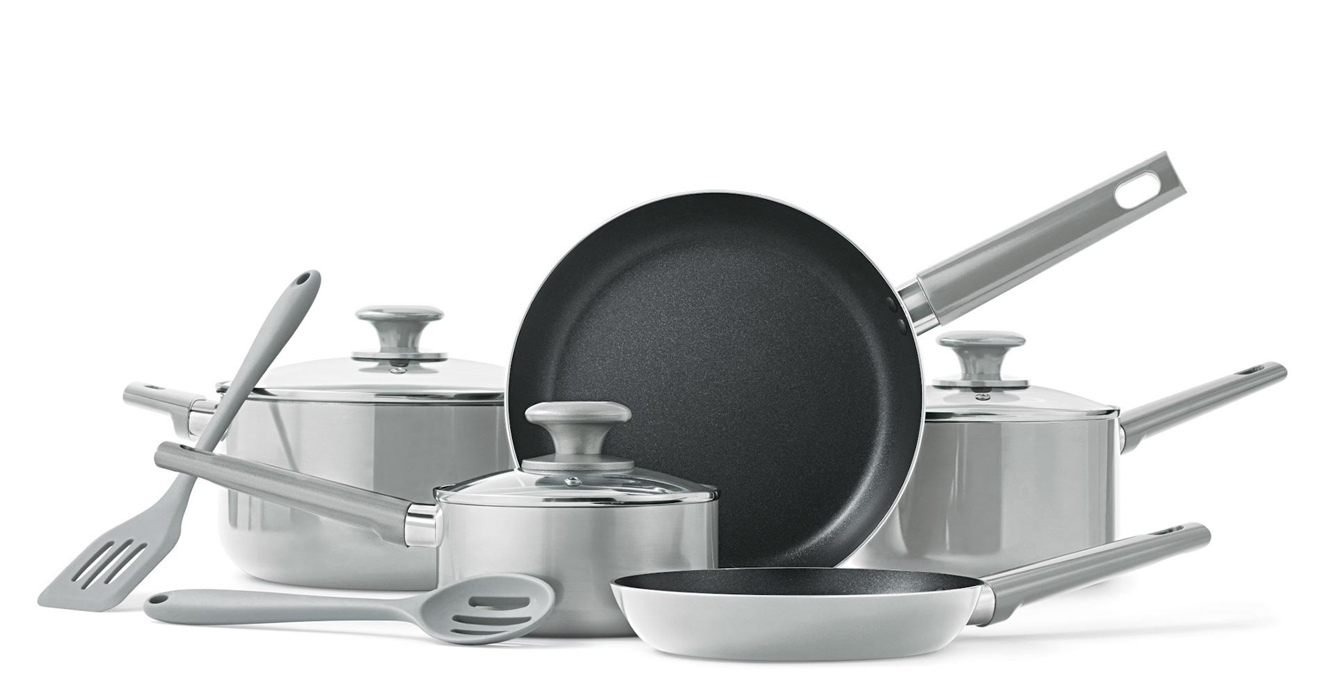
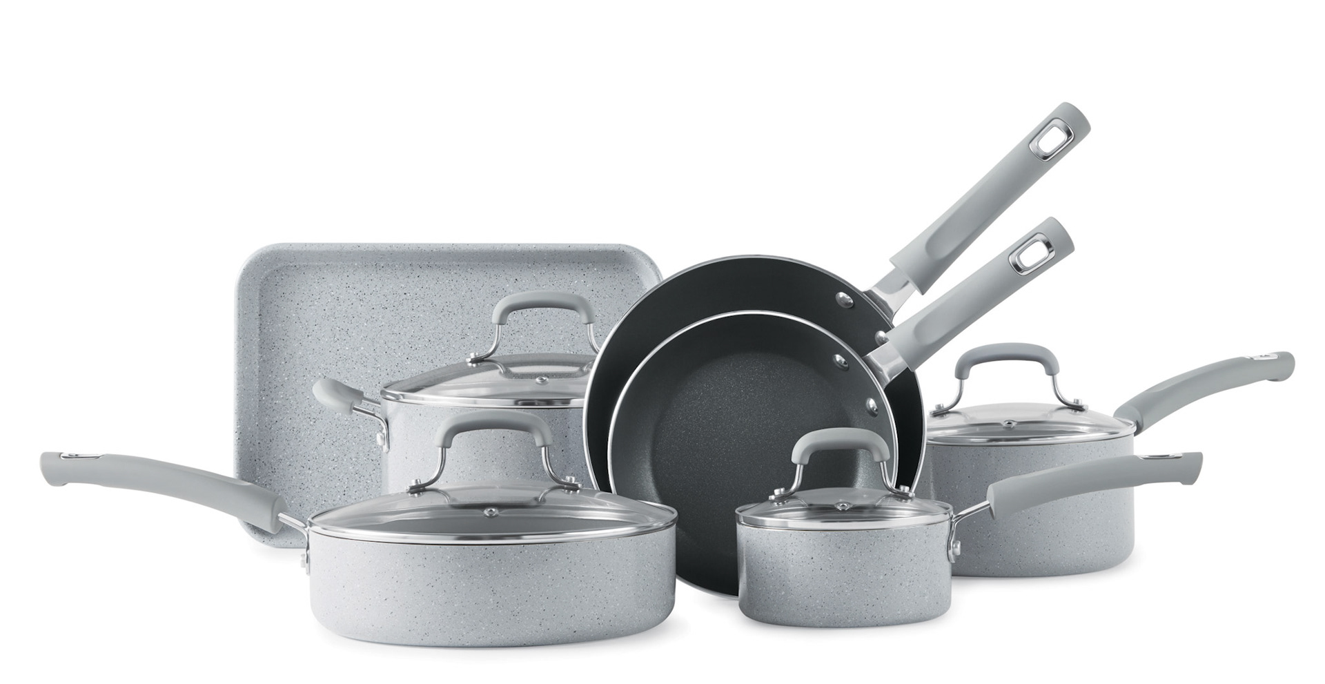
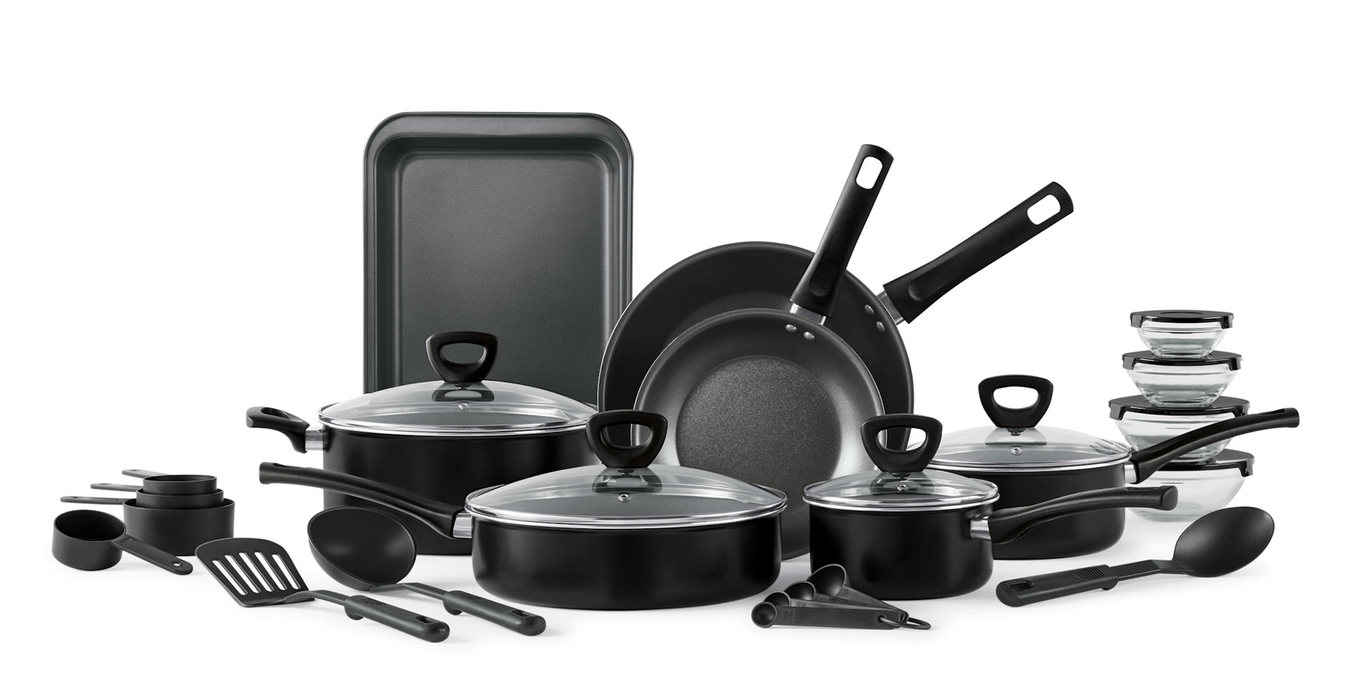
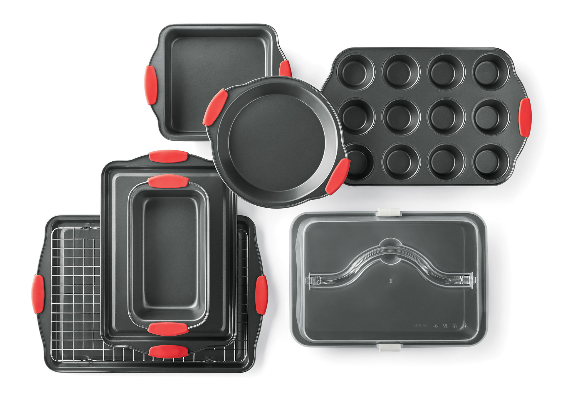
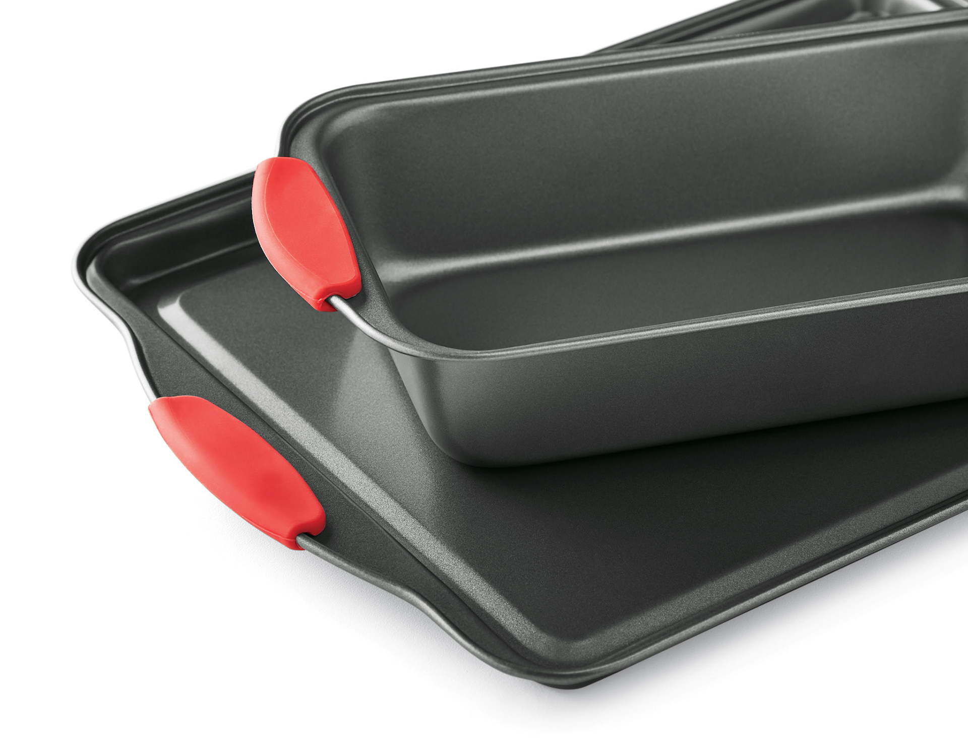
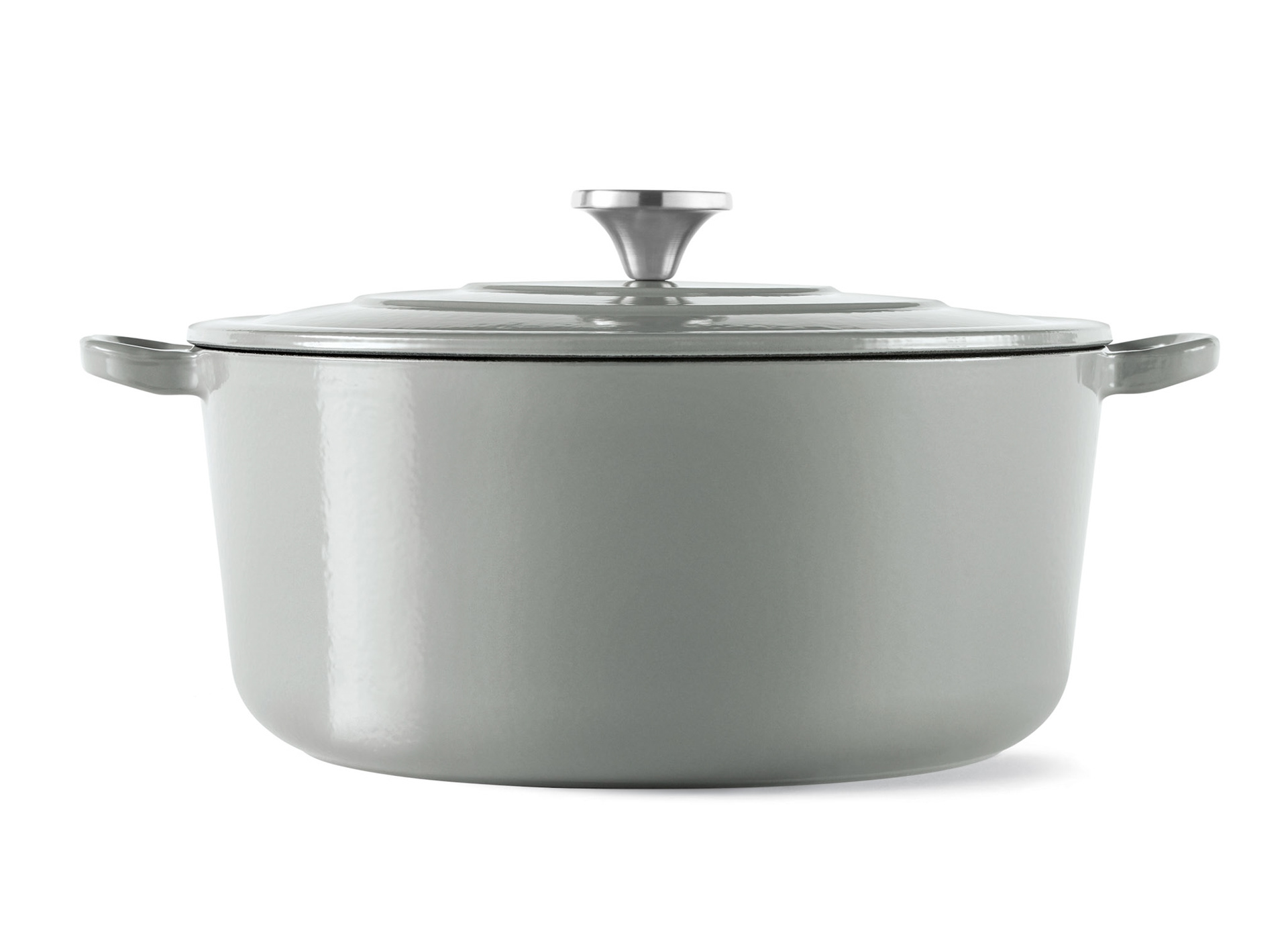
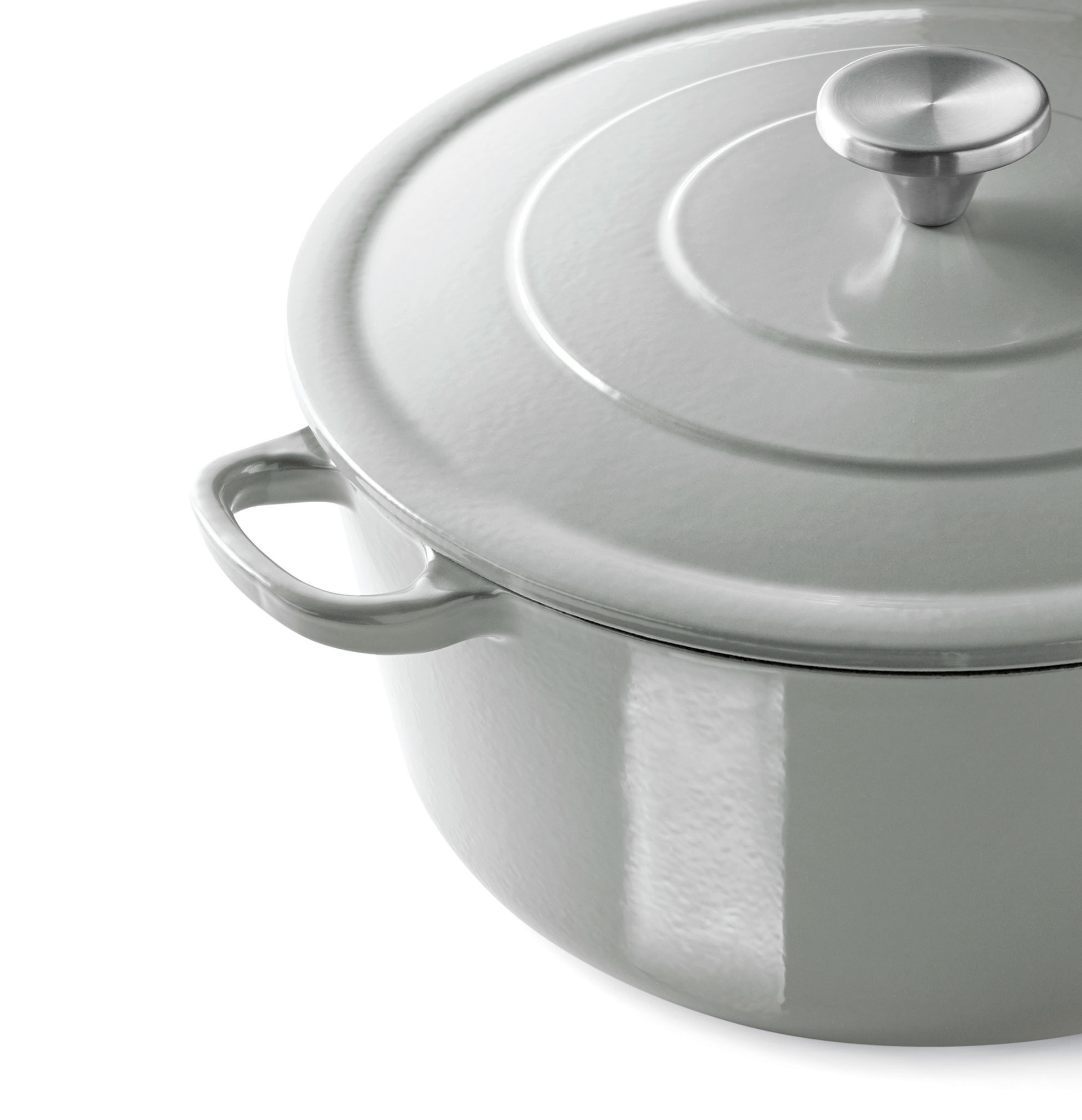
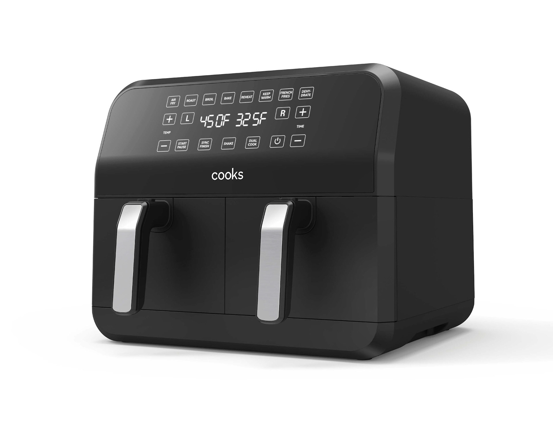
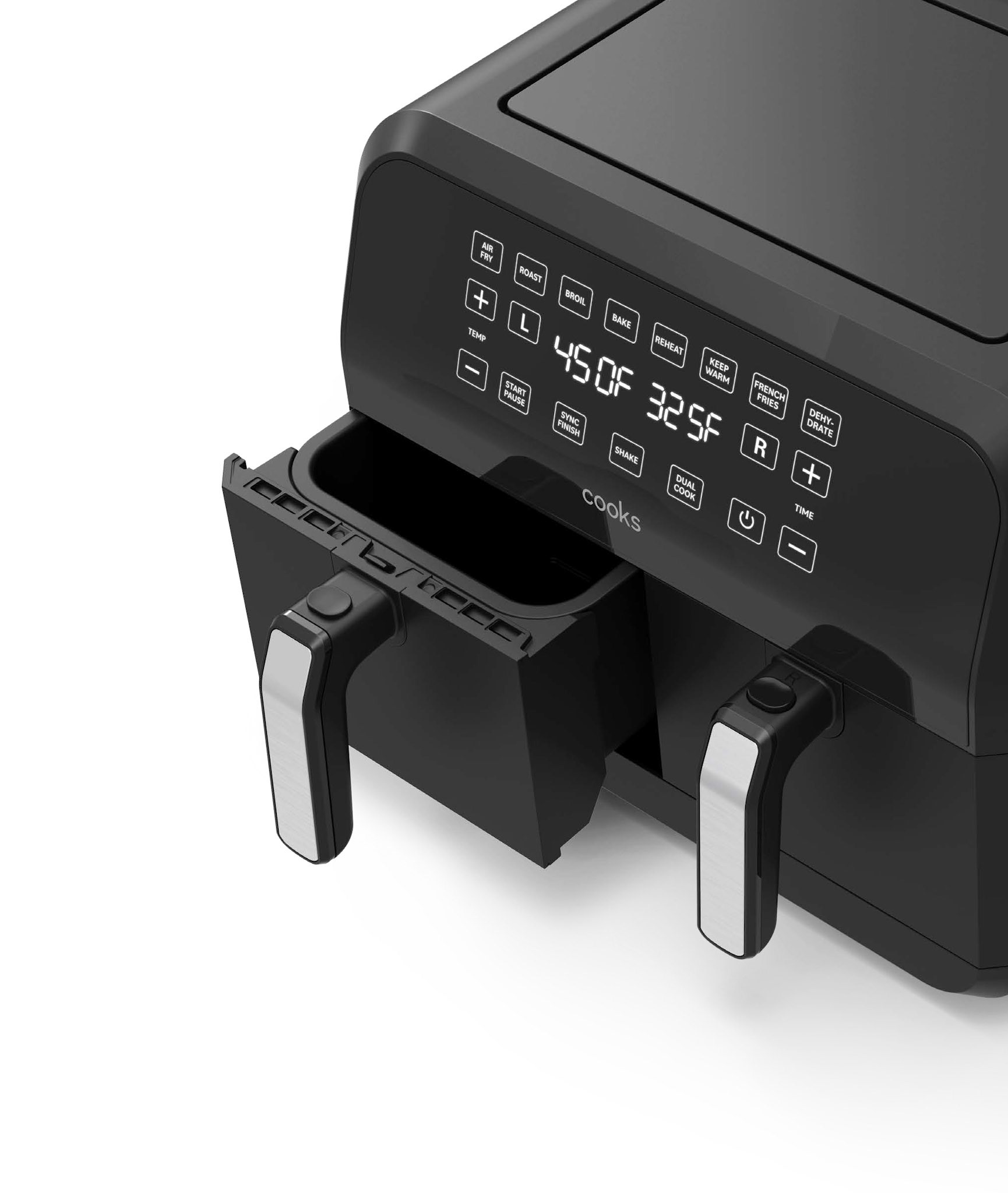
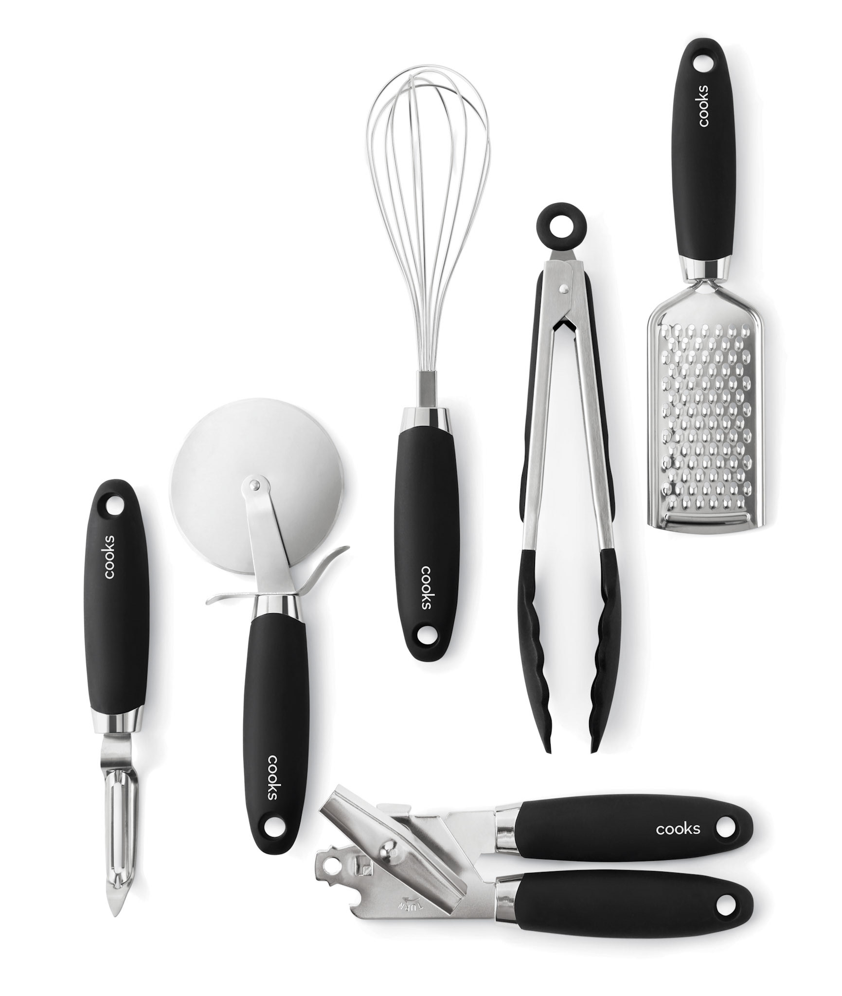
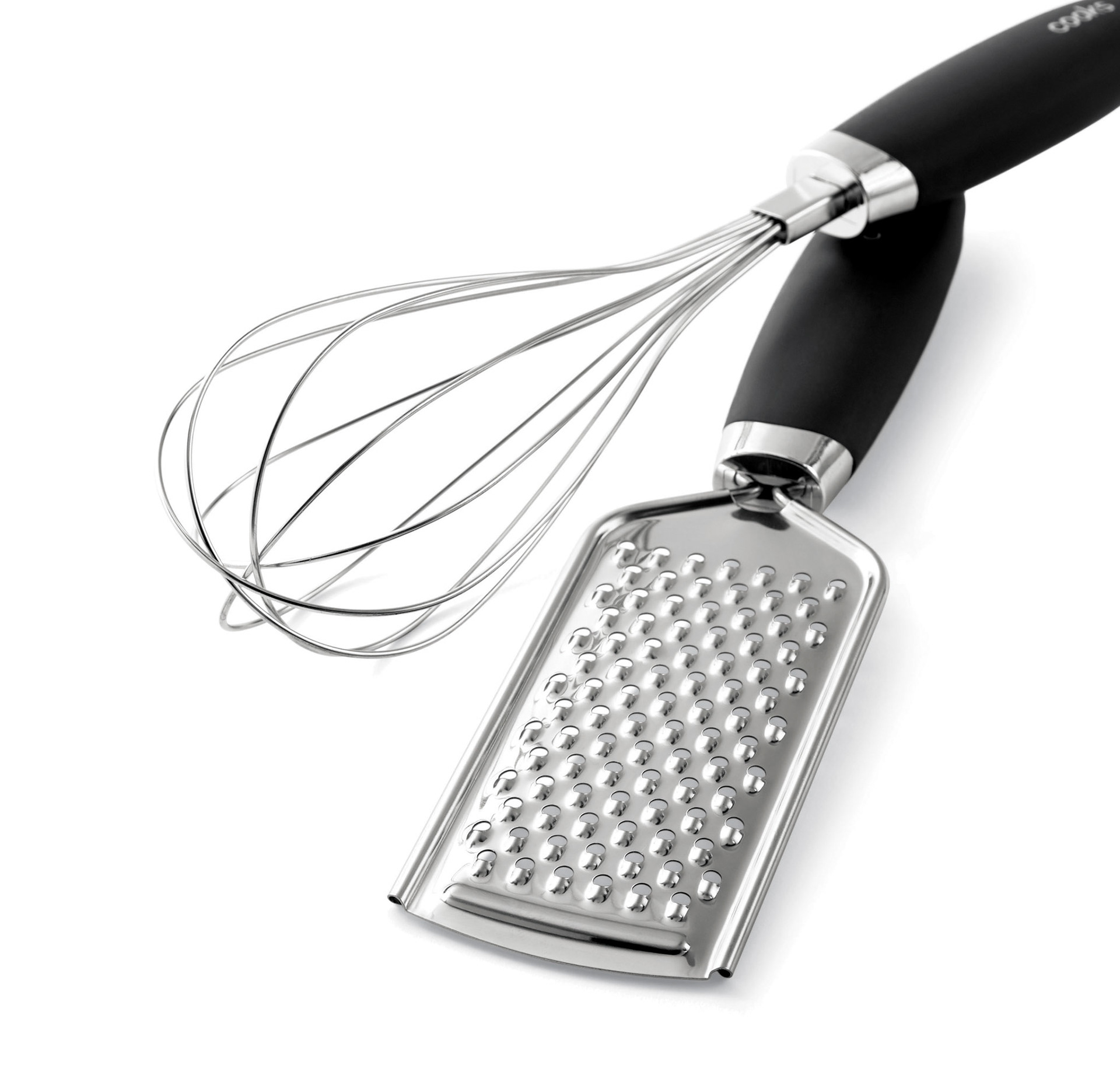
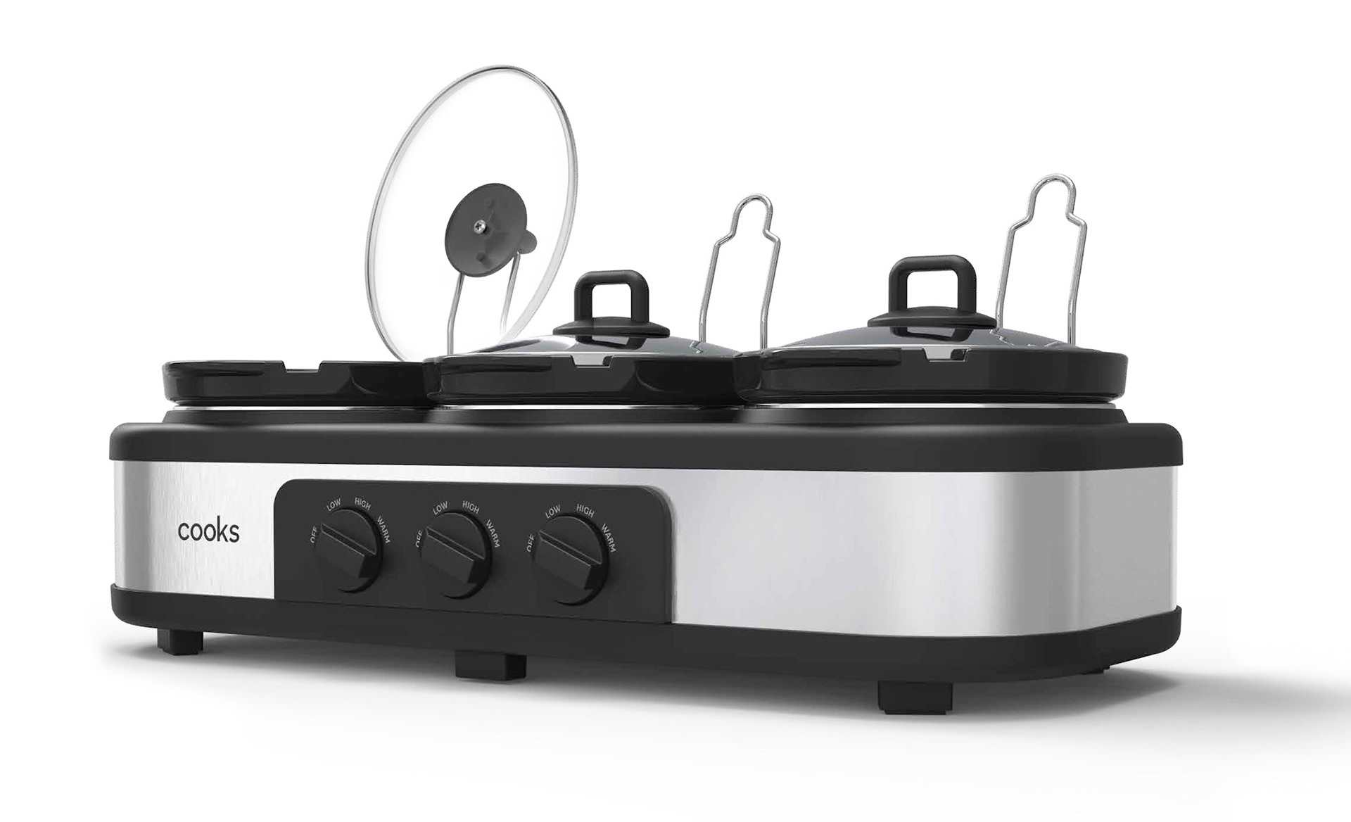
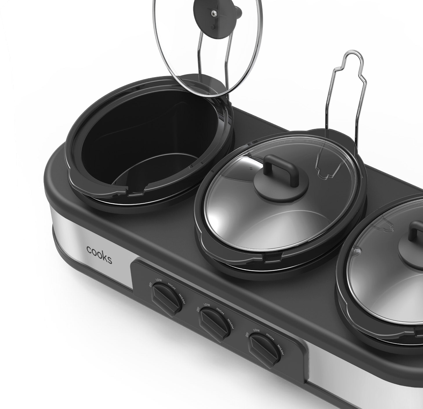
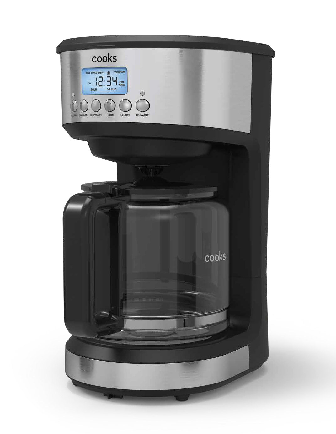
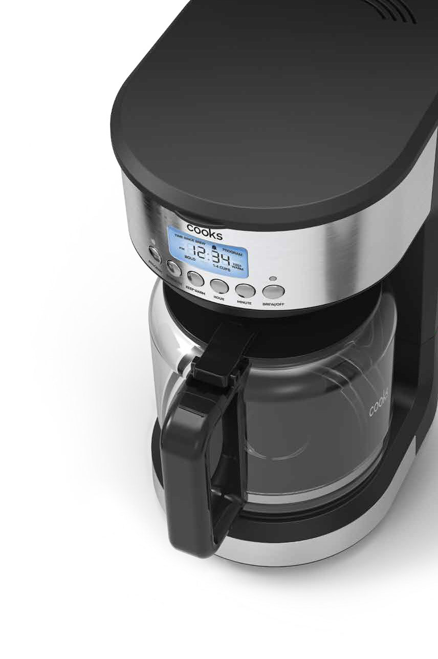
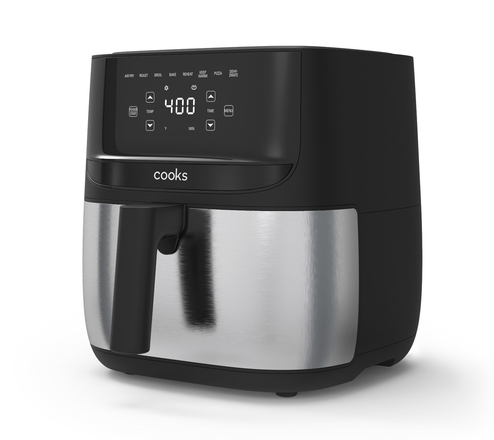
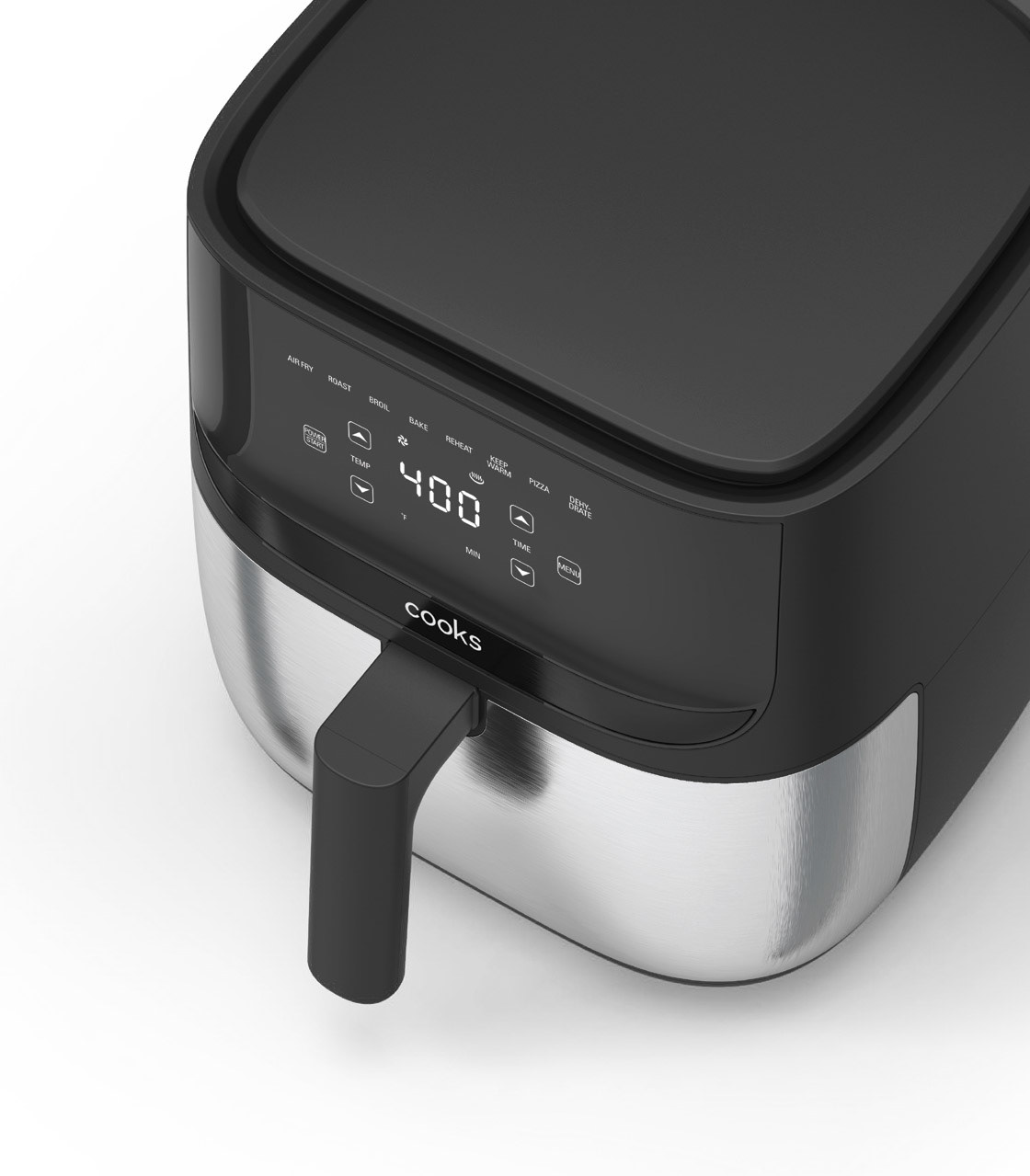
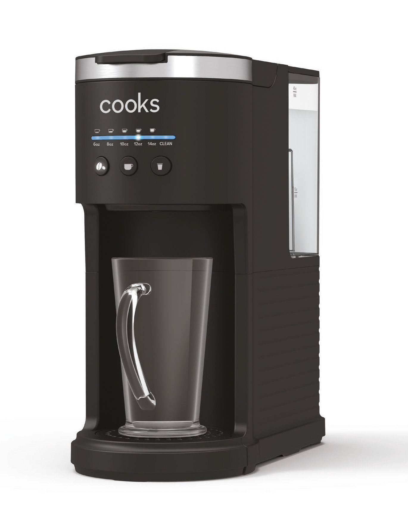
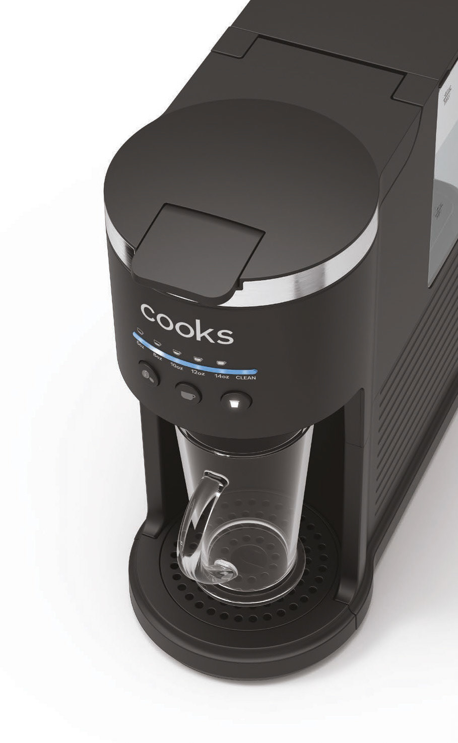
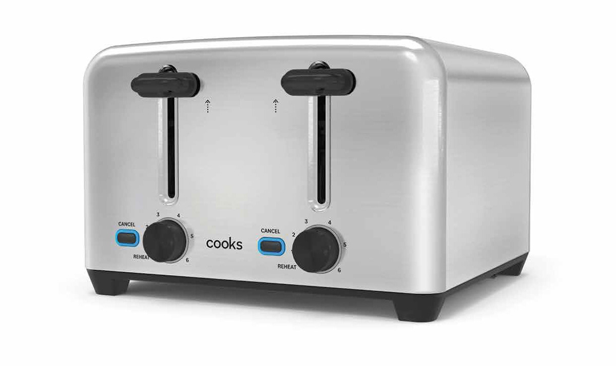
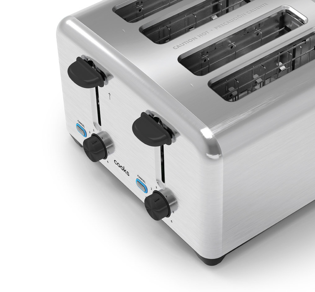
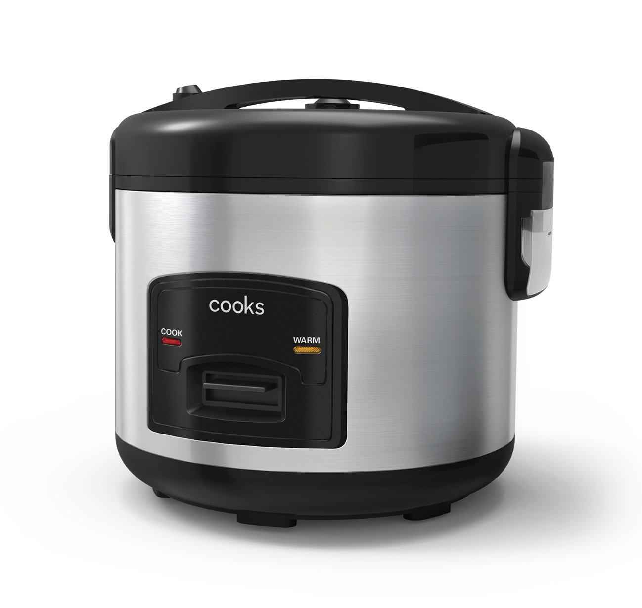
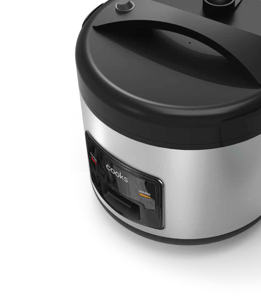
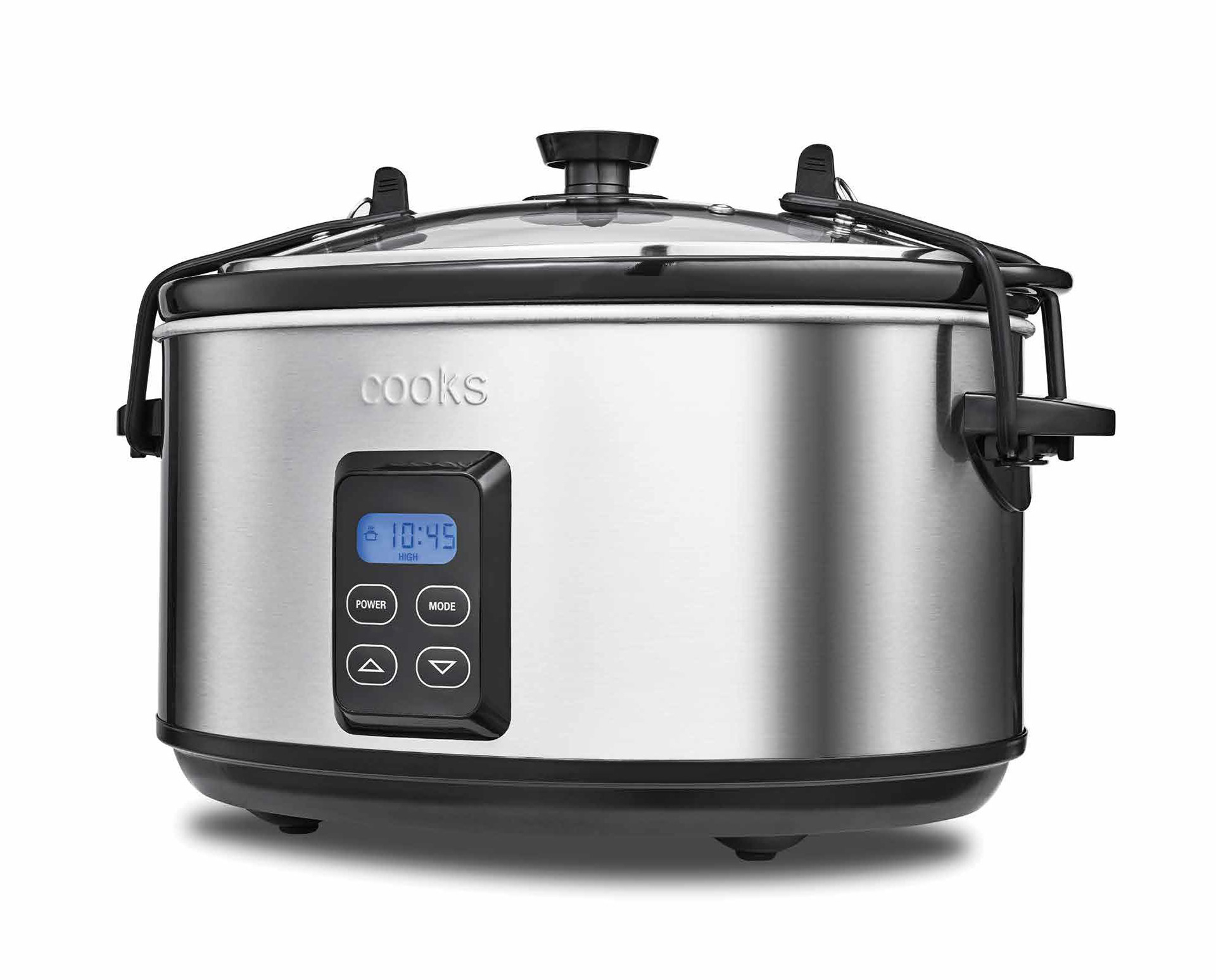
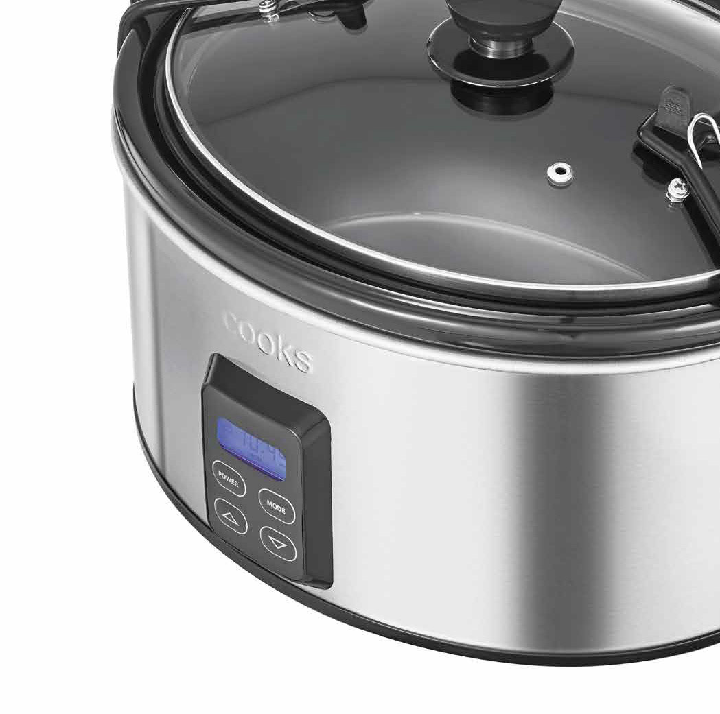
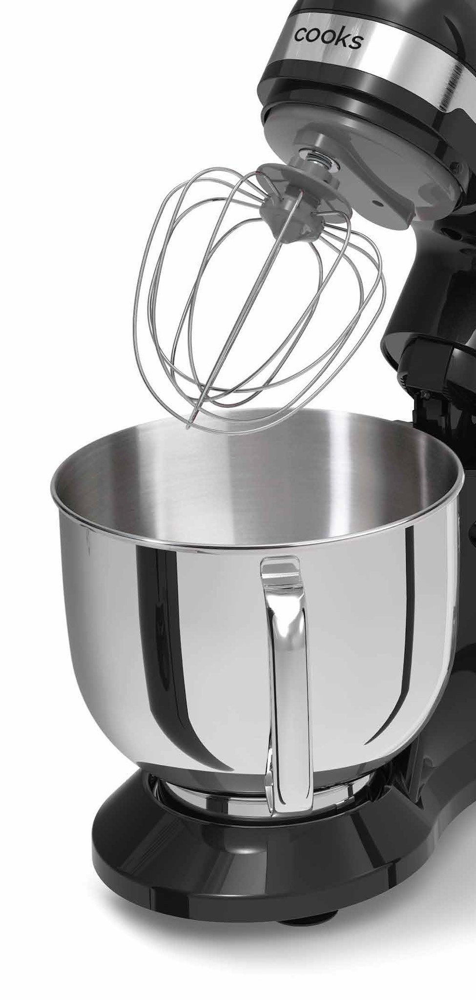
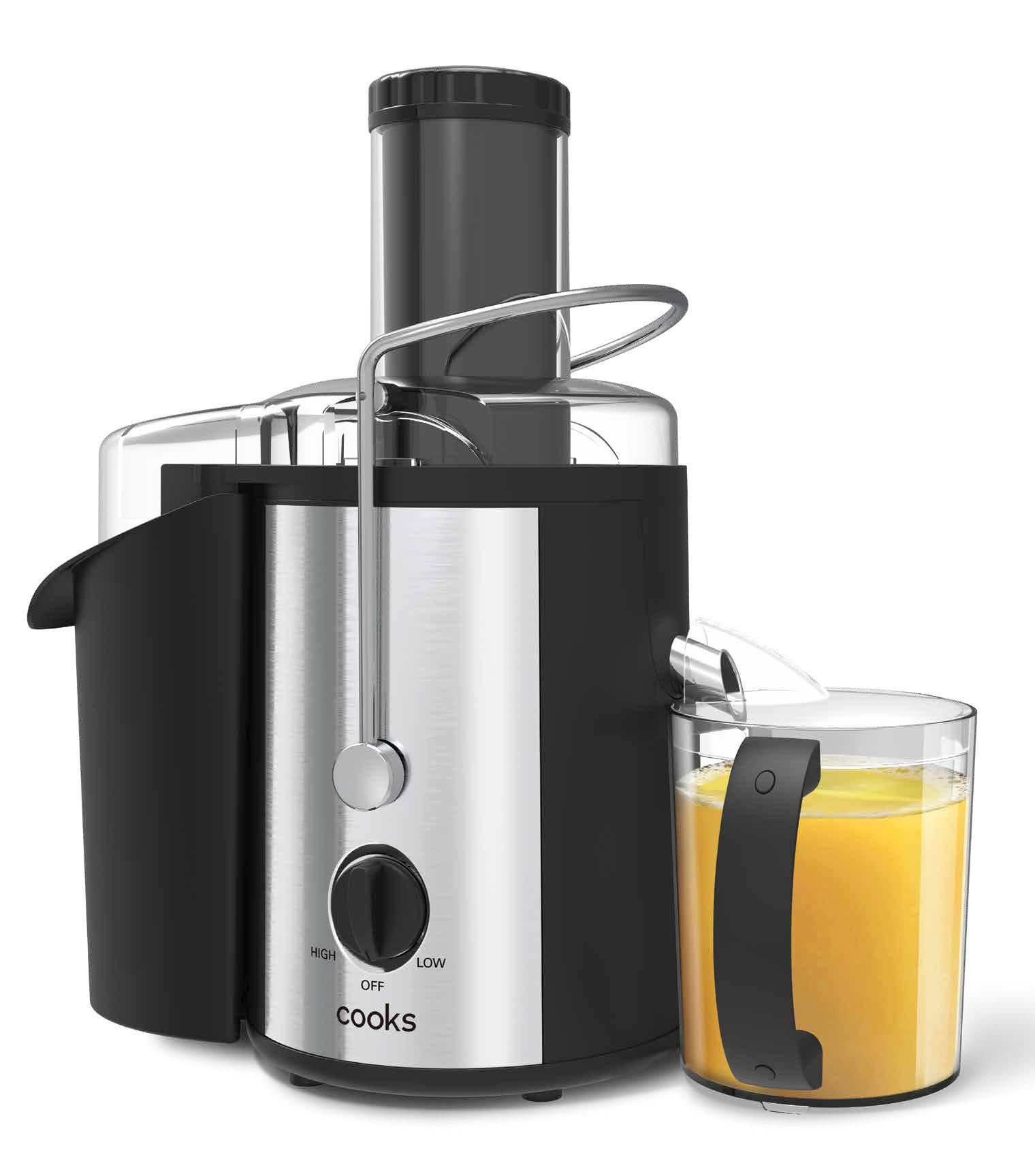
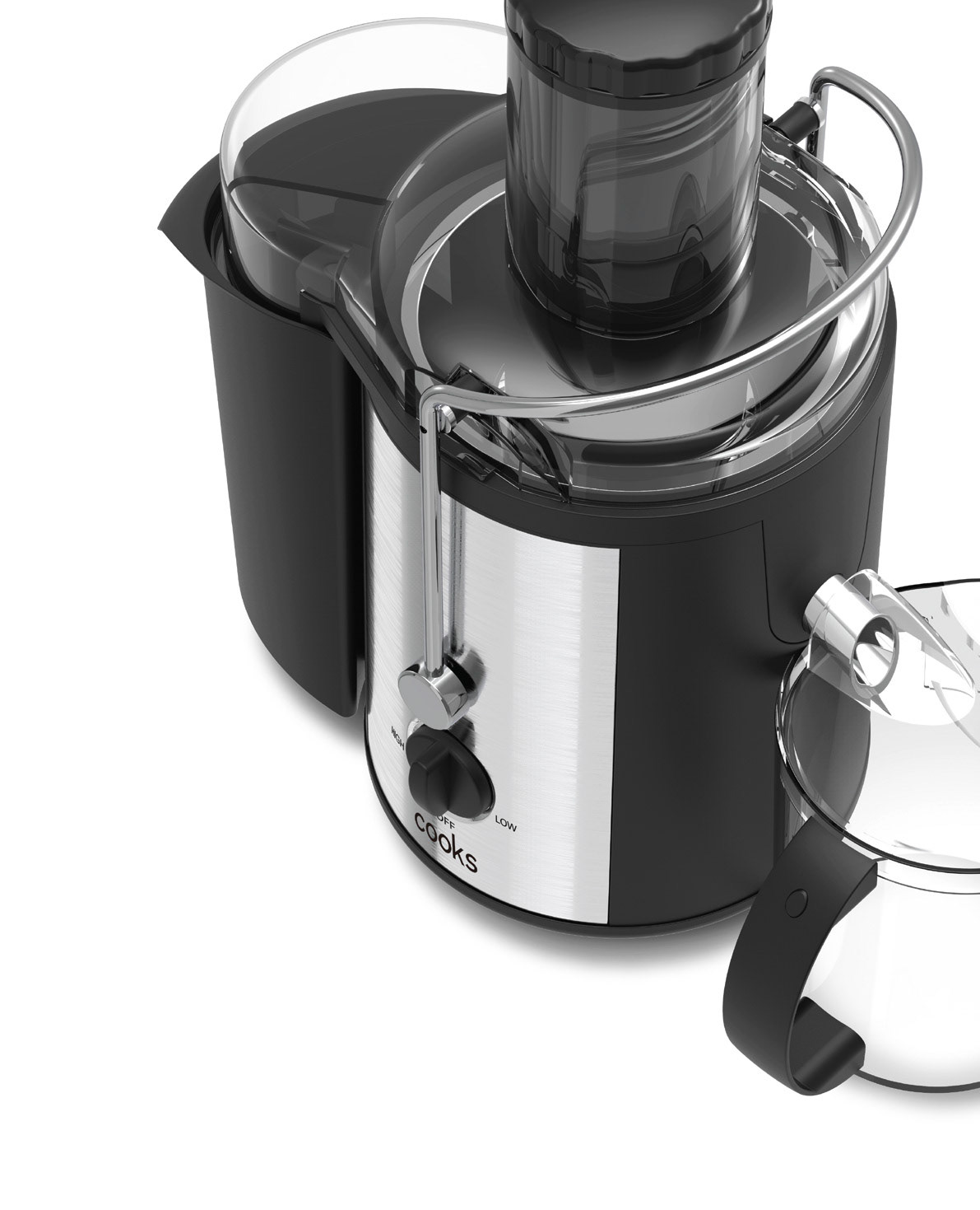
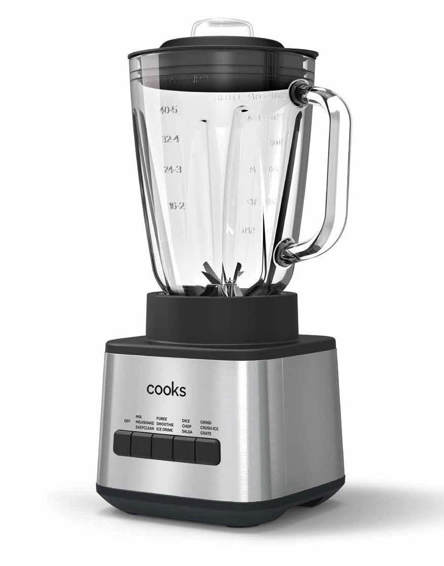
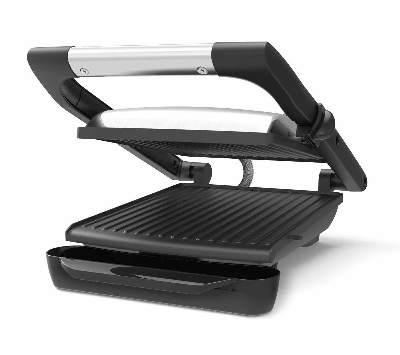
Photography Art Direction
The thought process was centered around elevating the product as the focal point of the packaging. To achieve this, we utilized graphic camera angles in combination with purposeful product arrangement, aligning with the brand's voice of directness and ease of use. Lighting played a pivotal role, ensuring that each shot featured impactful clean highlights that accurately represented the product's finish and quality.
The main image was specifically designed to wrap around the front corner of the box, allowing the packaging to leverage both the front and side surfaces to create a complete and compelling image. This design choice enables effective merchandising, enhancing the visual appeal of the product when displayed on shelves or stacked.
To ensure consistent and high-quality results, the final photography stage involved collaborations with multiple studios and suppliers. As the Art Director, I provided guidance and maintained control over the direction and overall quality of the photography for all packaging materials.